Sportmaster mobile app
2022–2024 · Senior Designer

From 2022 to 2024 I was responsible for the design of Sportmaster’s corporate app for store and warehouse employees. The app brings together in one place everything that used to live in email, in Excel and on paper at the shift supervisor.
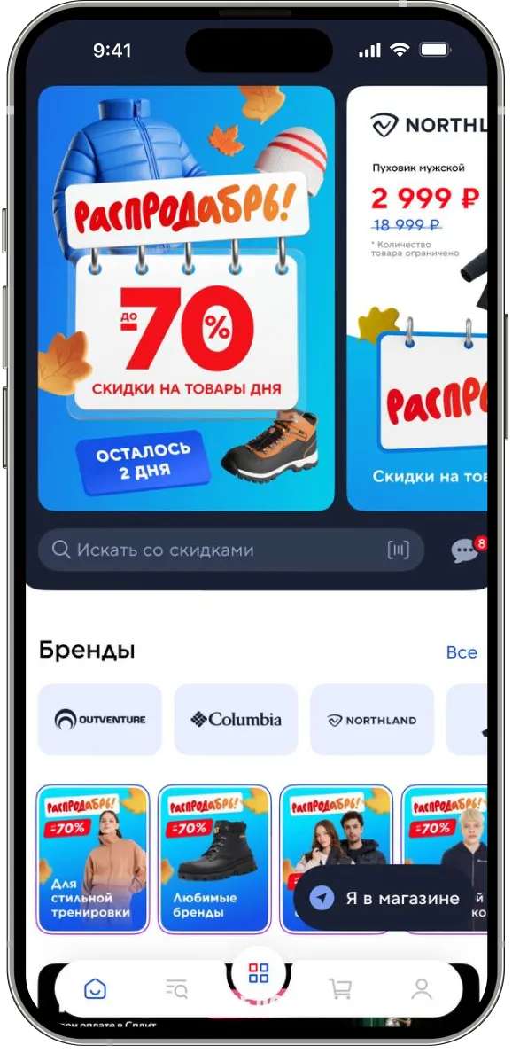
What’s in the app
Next — a case about the gift cards section. It was the most painful module at the start of the project: partner certificates arrived on paper, sat in the back room, and expired before activation. The screens below are from this section.
How it was
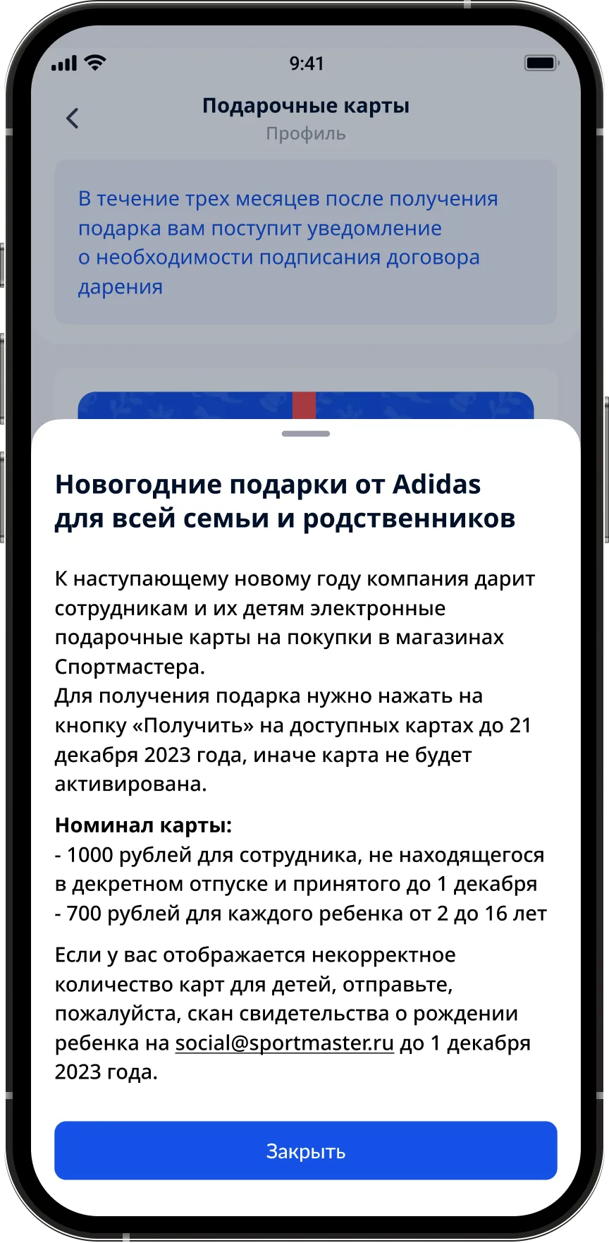
Sportmaster’s partners — Adidas, ASICS, Nike — issued gift certificates for employees: for the New Year, for anniversaries, for collection launches. The certificates arrived at the store as a stack of paper. The shift supervisor handed them out by hand, by list, with a signature in the log. Some cards got lost in the back room. Some reached the employee after the activation date and expired.
The metric we started with
Hypothesis
If we move the cards into the app and tie the barcode directly to the employee’s account, the card reaches them the moment it is issued, without getting stuck in a line to the supervisor. Deadlines and terms will live on the card itself, not in a PDF on the portal.
Principles
Four rules by which decisions on the gift cards section were made.
What I verified
Before the mockups — 14 interviews with sales consultants in six stores across Moscow and the surrounding region, plus analytics on card handouts for 2022.
The solution
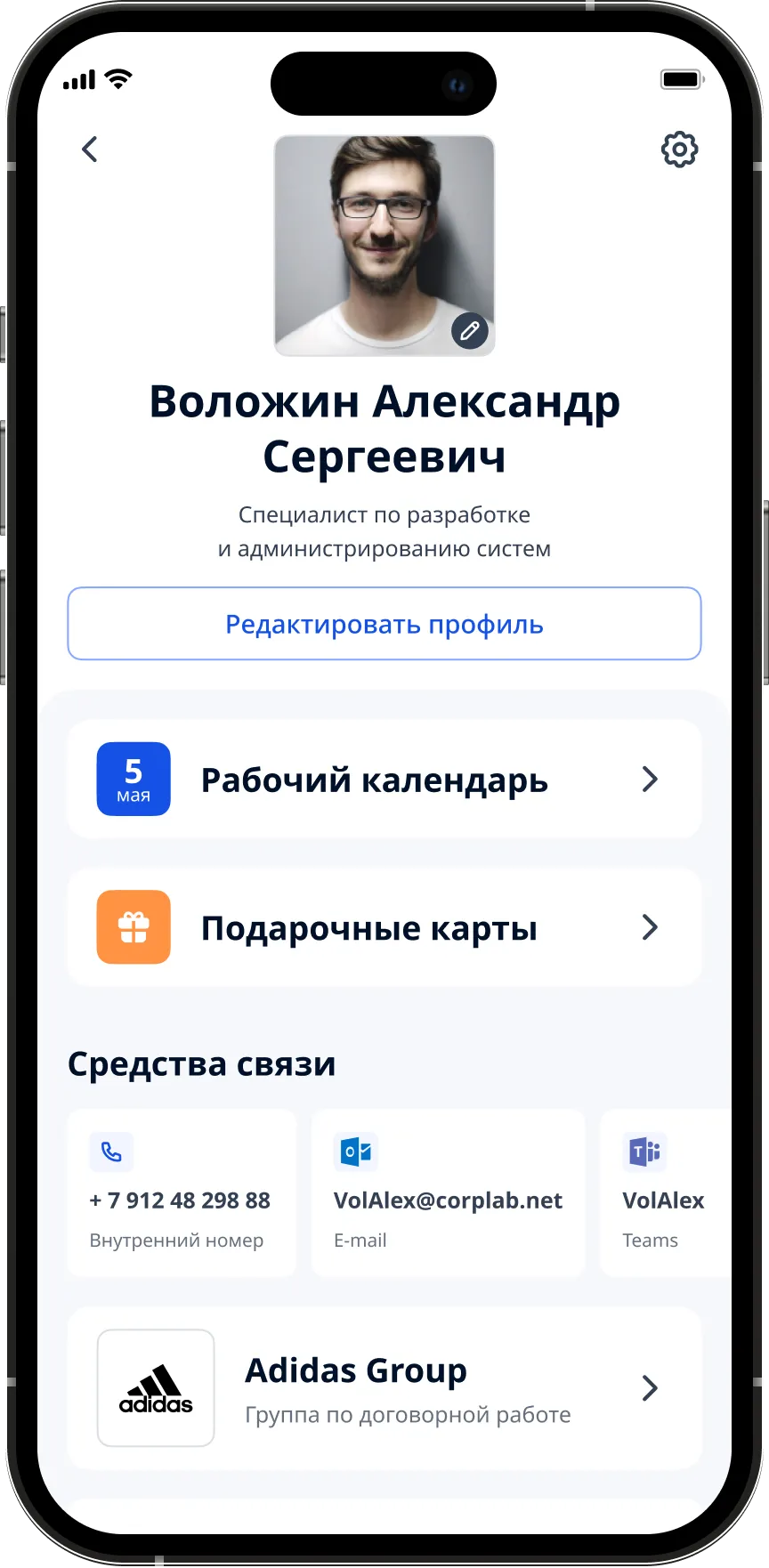
The gift cards section lives inside the employee’s main menu. The entry point to the cards sits right on the profile, between "Work calendar" and "Contacts". A partner card is tied to the account the moment it is issued and appears for the employee instantly.
On the employee’s home screen — a photo, full name, role and three quick buttons. Gift cards are second in line, right under the work calendar. Not in a menu, not in "Services", not in a tray. One tap — and the employee is on the list of their cards: each in the brand’s own design, and at the top a short rule about the activation deadline that can’t be missed.
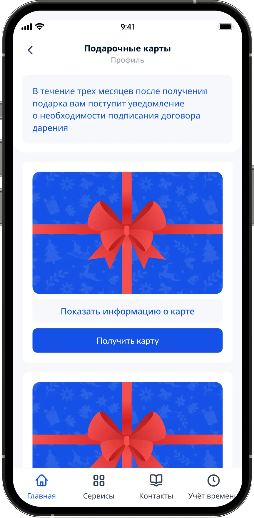
Each card is shown in the brand’s own design, with its value and activation deadline on the front. The type — kids’ or adult — sits right under the name. A paper certificate is no longer needed.
On the card — the certificate number, the card type and a hidden PIN code that opens with a tap on "show". The main action is a large "Show barcode" button. No extra fields or forms: everything the partner cashier needs is on one screen.
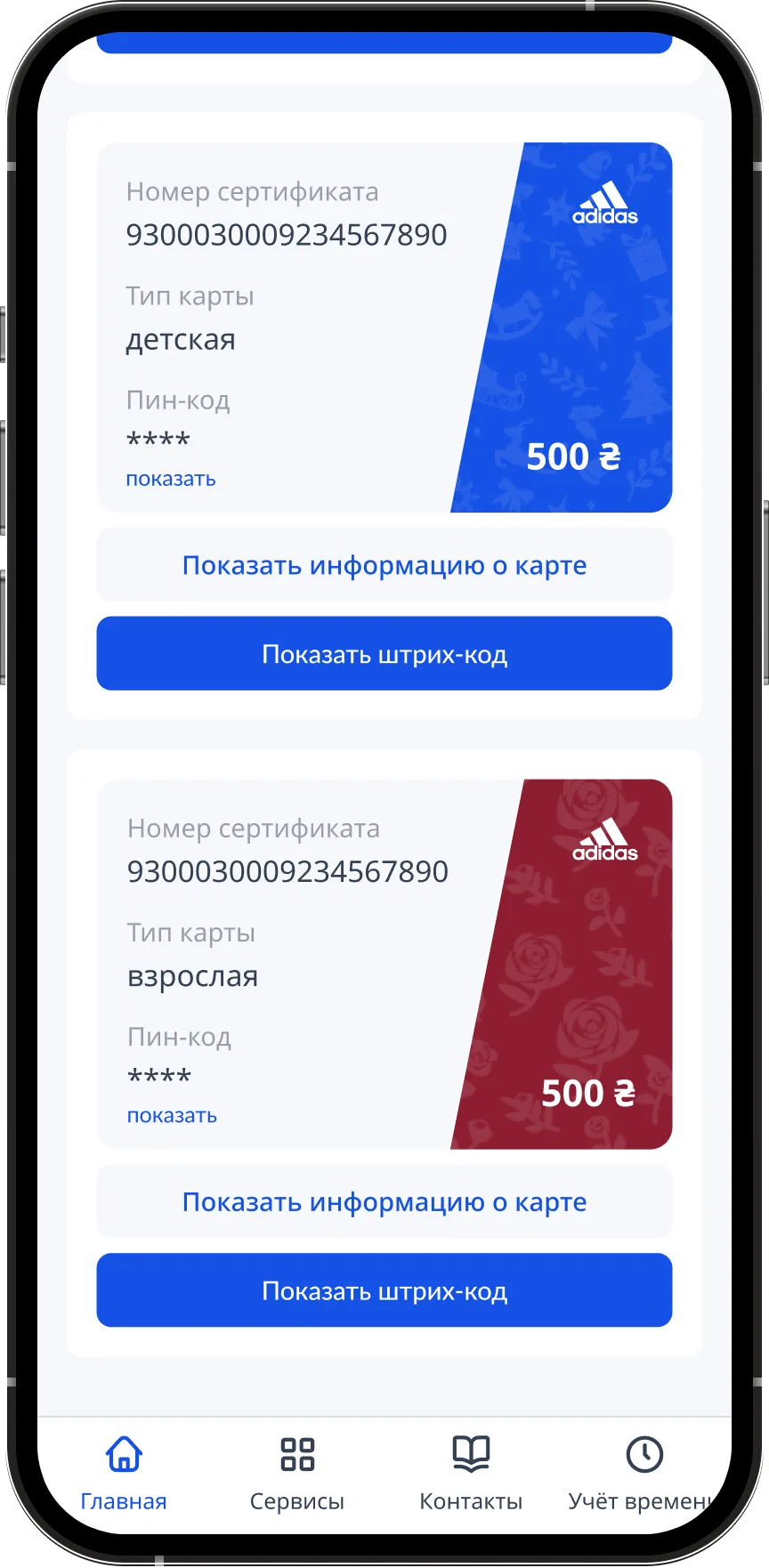
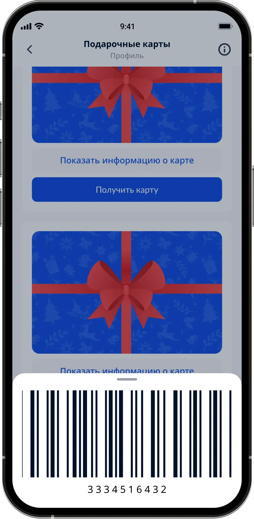
The barcode slides up as a tray from the bottom — you can show it to the cashier without leaving the app. The tray survives a screen lock: no repeat SSO is needed to show it again.
Activation deadlines, store restrictions, limits per child, a link to HR email for disputed cases — inside the card, not in a separate PDF on the corporate portal.
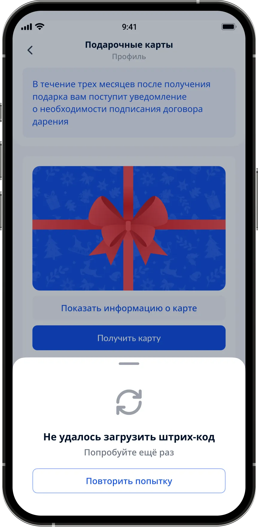
On the sales floor the connection is worse than in the office. The barcode of the last opened card is cached on the device. If something doesn’t load, the app honestly says "try again" instead of showing a white screen.
Why it worked
Before, the path to a gift card was four steps involving another person: walk up to the supervisor, wait in line, sign, take the paper. Now — two taps on the phone. This isn’t an "interface improvement", it’s a shift of responsibility from the manager back to the employee.
Some details and metrics are not disclosed due to an NDA. The figures on expired cards and handout time are based on the project’s internal analytics.