A new LMS for MAX × SkillFactory
2022 · Product Designer

SkillFactory is one of the largest Russian online schools for continuing education: Data Science, analytics, development, management. In 2022, at the MAX studio, I redesigned its LMS. Not "from scratch" — we rebuilt the interface on top of an existing engine that had been accumulating functionality for five years.
The old LMS was a storage for materials. The new one had to become a coaching tool — for the student and for the team supporting them: the group curator, the grading mentor and the cohort coordinator.
What’s in the LMS
Next — a case study about both sides. First, how the student sees their route, then how the mentor grades work, assigns scores and manages assignments. The screens below are split into these two cross-sections.
What it was
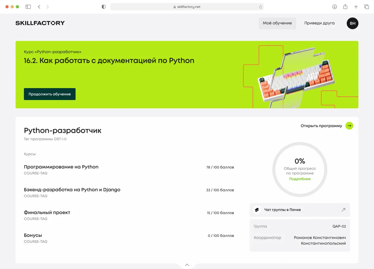
On the student side, the workspace grew by cards: every new course was stuck on as a separate tile, every new module as a tab. Overall progress had to be calculated in your head, multiplying points by weights.
On the grading-team side, submissions arrived by email, scores went into Excel, criteria lived in a Google Doc. A single mentor usually handled 40–60 students at once, and every day started by working out who had already been looked at and who hadn’t. The cohort coordinator distributed work between mentors by hand — also in a spreadsheet.
"I don’t understand how far through the program I am. It’s just a list of courses with points."
"Where do I see which course matters most right now? I’d spend my time on it instead of spreading it evenly."
"The curator chat is in one place, the points in another, the progress in a third. My head spins."
— From 22 interviews with students of Python development and analytics.
"In the morning I get 40 submissions to grade, and by the end of the day I don’t remember whom I’ve already looked at."
"The grading criteria are in one Google Doc, the score goes into a different interface. I cross-check every time."
"I can’t see which of my students has a deadline coming up."
— From 8 interviews with mentors of Python and Data Science courses.
The metric we started from
Roles
The LMS solves the problems of two different people. One learns, the other supports.
 Student — learns, understands their progress and submits work
  Mentor and curator — grade work, assign scores and keep the student on route
 Hypothesis
Progress as a table is a report. Progress as a circle is a route. If we move the student’s achievements into a visual form, and build the mentor’s work around a queue of tasks with the criteria inside the card, both sides will stop decoding the platform and start teaching and grading.
Principles
The student’s side
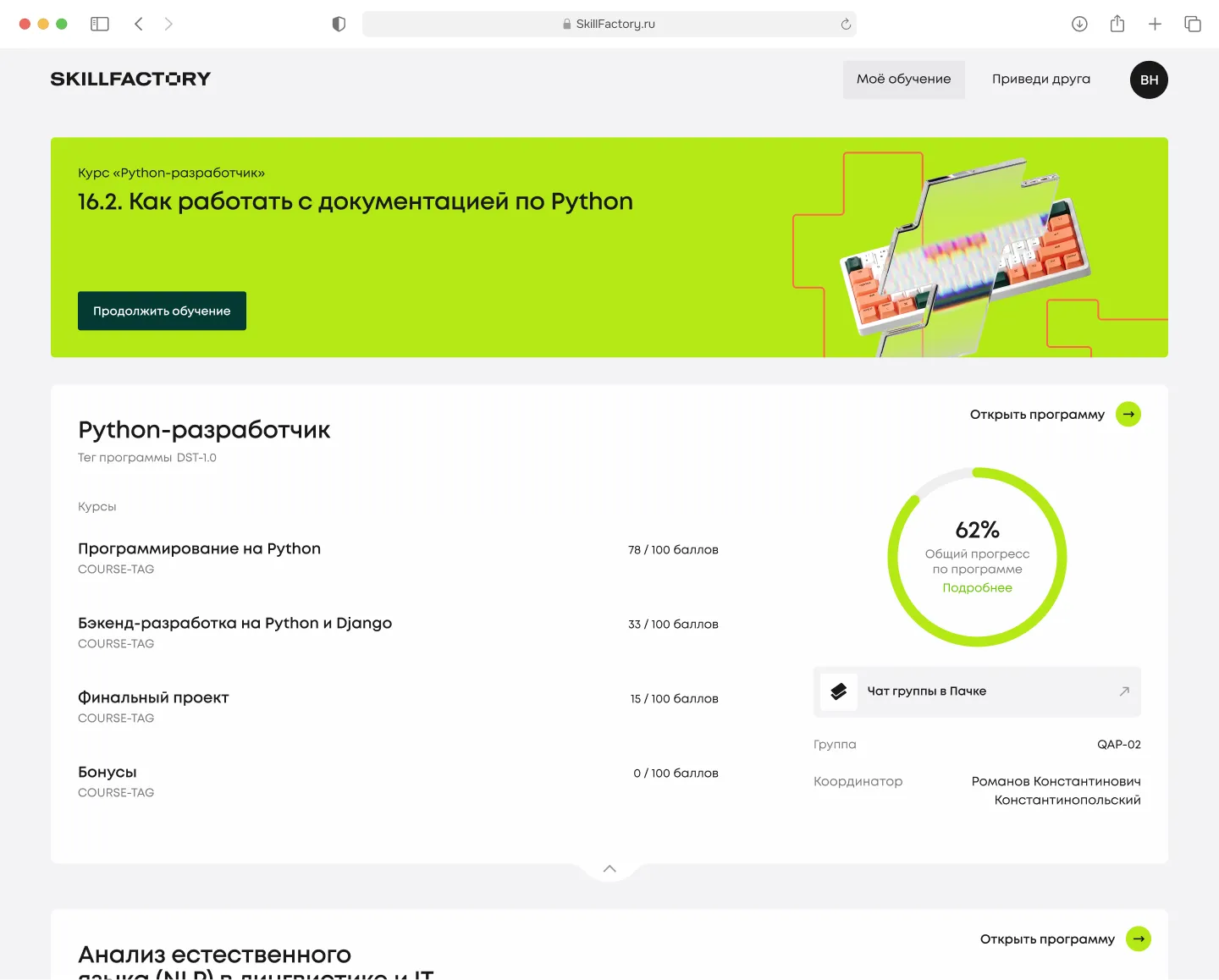
The student workspace is built around two anchors: a list of programs with quick entry into the current lesson, and a circular indicator of overall progress for each program.
A student often studies two or three programs at once (for example, Python development + Language analysis). Each program is a full-screen card, with its own banner for the current lesson, a list of courses with points, and circular progress. Scroll = switching programs, no tabs.
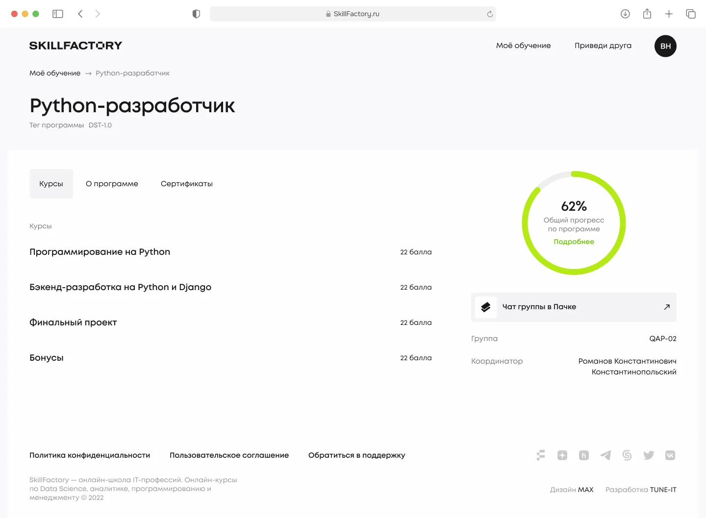
Three tabs: Courses, About the program, Certificates. Program progress is shown with the same circle as on the home screen — a single visual metaphor. In the right column: the coordinator, the group and the chat in Pachca, so the student doesn’t have to hunt for who to message.
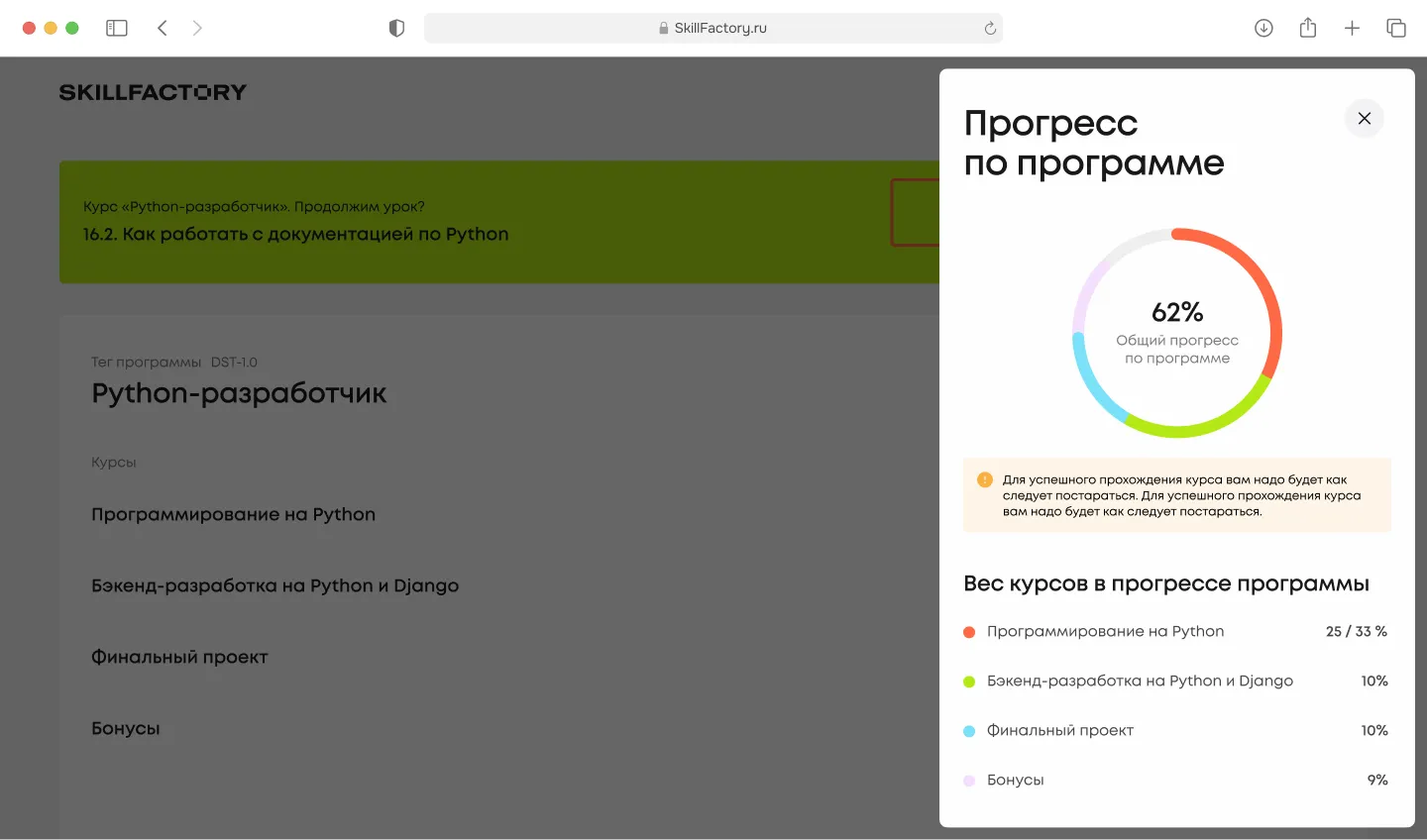
Clicking "Details" slides out a panel with the breakdown: 25/33% — programming, 10% — backend, 10% — final project, 9% — bonuses. The segment colors match the colors in the circle. The student understands what their 62% rests on.
I spent several iterations trying to cram deadlines, activity and the mentor’s grade into one circle as well. It didn’t work. The eye couldn’t read three layers at once. In the end one rule held: one circle — one metric. Everything else went into the panel.
The mentor and curator’s side
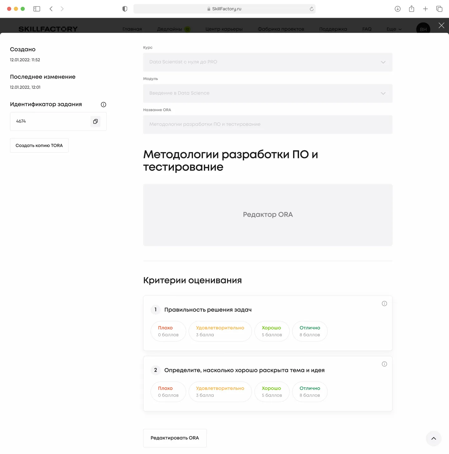
The grader’s workspace is built around the feed of submissions to grade. Everything else — the task editor, assignments, statistics — is one tap deeper.
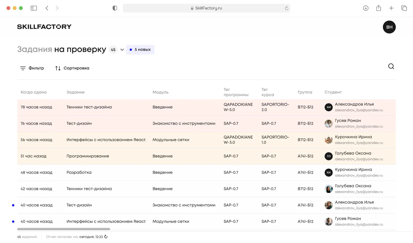
The mentor’s main screen is the "Submissions to grade" table, 45 in progress and 5 new. Columns: when submitted, task, module, program tag, course tag, group, student with email. Rows highlighted by priority: new ones with a dot, long-submitted ones with a soft fill. Filter and sort by deadline at the top. A submission opens in one click — no folders, no switching.
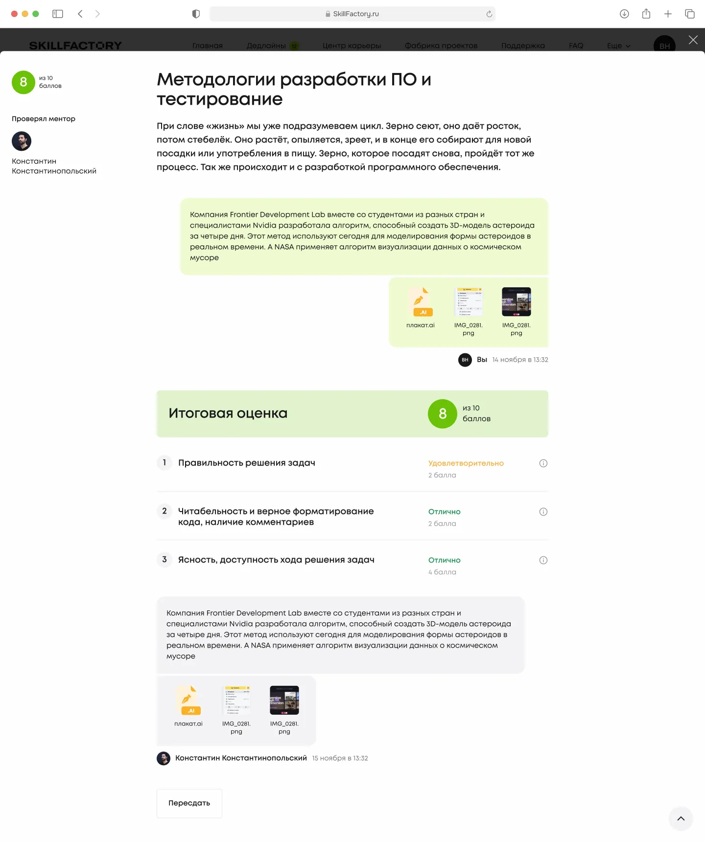
Inside the submission card: the task text, the student’s files, and right there the final score against criteria — correctness of the solutions, readability and correct formatting of the code, logic and clarity of the code for other developers. For each item, four levels with points from "Poor" to "Excellent". The mentor doesn’t go off to a Google Doc for the rubric — it sits on the same page. At the bottom: a field for written feedback and a "Send to student" button.
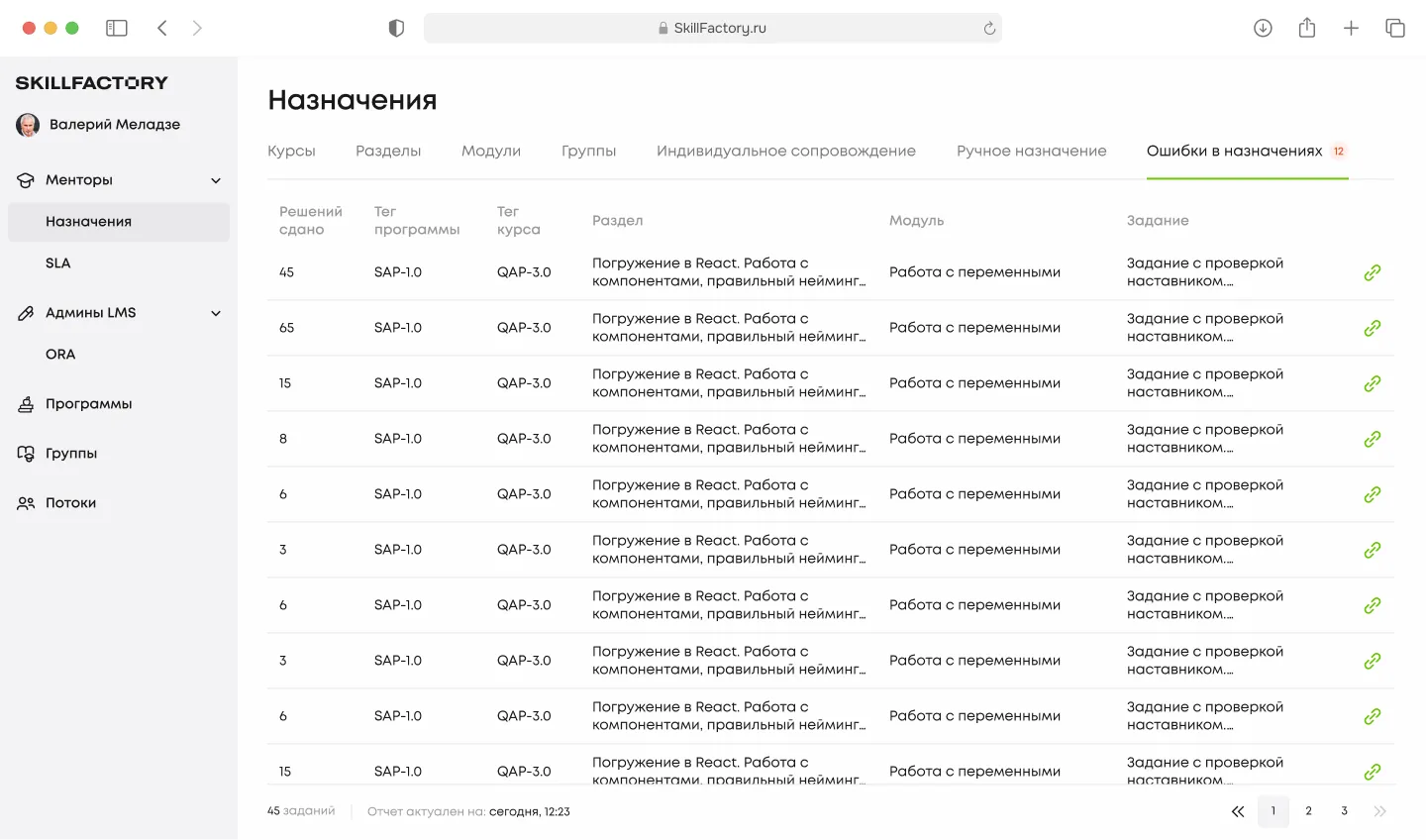
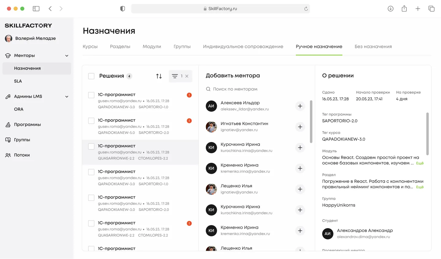
The "Assignments" section — for cohort coordinators and LMS admins. Tabs: Courses / Sections / Modules / Groups / Individual support / Manual assignment / Assignment errors. The last one is a separate focus: if automatic distribution didn’t find a mentor (12 cases in the slice shown), that submission is highlighted in red and resolved by hand. No "hanging" submissions left ungraded.
When the mentor creates a new graded task, they immediately see every layer: course, module, identifier, a content editor with video and photo support, and grading criteria as cards with four levels. Each criterion is a separate card with a hint on "what counts as poor / satisfactory / good / excellent". The student then sees the same rubric inside the task — no surprises at grading time.
Results for SkillFactory
The main shift isn’t in the visual language, it’s in how attention is distributed. The student stopped decoding the interface. The mentor stopped assembling the rubric from three tools. The coordinator stopped being an Excel dispatcher.
The LMS used to be a storage for materials. It became a tool the team coaches with, rather than hands out. My work on the project stopped being "draw the workspace screens" — it became "decide what matters to the student on their route and what is secondary".
Some details and metrics are withheld due to NDA.