
Investor dashboard at D8
2026 · Senior Designer
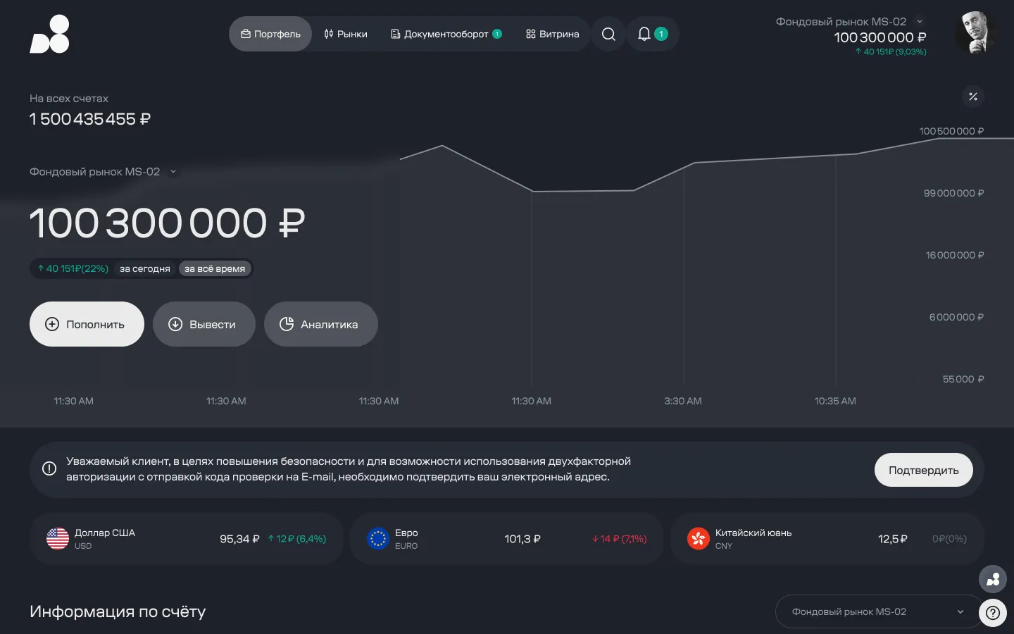
D8 is an investment house — not a mass-market broker. It works with high-net-worth private and corporate clients, each assigned a personal relationship manager. The client dashboard is the web surface where clients view their portfolio, trade on the exchange, and buy over-the-counter products.
I worked on the dashboard redesign as a product designer. My part was the trading surface: portfolio, quotes, the options board, and screen states. The over-the-counter product catalog and document workflow were owned by other designers on the team, and they appear in this case only where they intersect with my scenarios.
Where we started
The old dashboard was a holdover from the terminal era: dense grey tables, tabs stacked three rows deep, section names lifted straight from the back-office system. Clients used it — but as a reference tool. Anything beyond “check the balance” they did by voice: calling their relationship manager and asking them to handle it.
That’s expensive for the house twice over. The relationship manager is the company’s most expensive resource, and their job is to sell — not to read account balances aloud. And a client used to calling doesn’t open the dashboard, which means they never see what the house is selling on the catalog.
The brief
The redesign’s success metric wasn’t “improve usability” — it was specific: raise the share of operations clients complete themselves, without calling a manager. We started at 38%. Everything else follows from that.
Hypothesis
Clients don’t call because they can’t figure it out. They call because they’re not sure they’ve read the screen correctly, and the cost of a mistake is high. So the fix isn’t education — it’s certainty: leave no room for double interpretation, and flag restrictions before the client starts acting, not after.
Which leads to a conclusion that runs against the grain of most products: you can’t simplify your way out of this. Every detail hidden for the sake of a cleaner screen is one more reason to double-check by phone.
Four gates every decision had to pass
The redesign was large, and every screen was up for debate. To keep the debate off matters of taste, we fixed four checks. A decision that failed at least two of them didn’t ship.
Money that doesn’t exist yet
The most common source of confusion in a brokerage dashboard is the gap between a trade and its settlement. A client sells an asset: the trade is done, the position is gone, but the money arrives only after settlement. They can buy another instrument with it right away — but they can’t withdraw it yet. That’s not an edge case, it’s daily normal operation, and a single “balance” number doesn’t describe it.
There’s a second reason the balance “doesn’t add up” — margin. Open positions on the derivatives market lock up part of the funds, and the client can’t use it until the position closes. In the interface this is a lock icon with an amount next to the free balance: the locked funds are shown as a separate figure, not silently subtracted. Subtract it silently, and you get a call asking “where did my money go?”
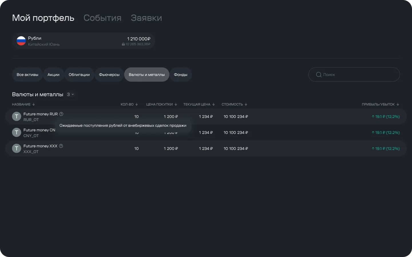
In the portfolio, these amounts show up in a line labeled straight from the back-office system — “Future money.” Behind it are expected proceeds from over-the-counter sell trades. The client sees it in their portfolio and has every right not to know what it means.
I proposed renaming it into something human. Back-office pushed back, and rightly so: it’s not a screen label — it’s the name of an accounting entity that reconciliation depends on. Rename it in the dashboard and it drifts out of sync with the brokerage report and statement, and the client ends up seeing three different words for the same money across three documents. That would make things worse, not better.
The compromise: we kept the name and put the explanation right in the line — not as a footnote or a link to a help article, but as a tooltip exactly where the question comes up. This was a case where the right design call loses to the right accounting call, and pushing the argument further would have been stubbornness.
A mid-project reversal
In the first build, the account switcher lived in a dropdown in the header — compact, the way it’s usually done in products with a single account. Testing showed what that actually cost.
We had designed for someone with one account, when we needed to design for someone with several contracts at once. The same quotes screen means something different depending on which account you’re viewing it from: an instrument might be available on one and not another, margin requirements differ. The interface said nothing about any of that.
Which is where the one deliberate duplication in the whole dashboard comes from: the account and its balance appear both in the screen body and in the header. The header stays put while scrolling long tables, so context is visible at the moment of action, not just at the moment of entry. It cost us a strip of screen real estate and one long argument with product about “why show the same thing twice.”
Screens
At the top, the overall picture across all contracts; below it, the selected account with a chart; below that, the three actions clients come in for most: deposit, withdraw, analytics. The prompt to confirm an email for two-factor authentication is shown as a strip under the chart, not a modal on entry. Security matters, but blocking a client’s own money to enforce it just trains them to close dialogs without reading.
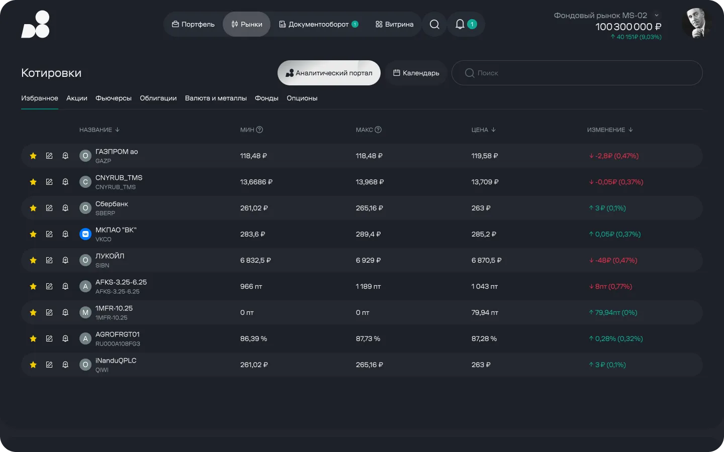
Asset classes are priced differently: stocks in rubles per share, bonds as a percentage of face value, futures in points, currencies at an exchange rate. This isn’t a styling detail — it’s different entities living in the same “Price” column. So the unit is always printed next to the value: otherwise a percentage-of-face-value figure sitting under a stock price reads as a data error, and that’s one more reason to pick up the phone.
Bonds are a trap of their own. The quote is a percentage of face value, but the client actually pays more — accrued coupon income gets added on top. The price in the list and the amount in the order legitimately don’t match, and if that’s not explained, the gap reads as a system error. Accrued interest is broken out as a separate figure on the instrument card — where the client is doing the math — rather than in the shared table, where they’re comparing instruments against each other.
At the start of each row — favorite, an instrument note, and a price alert. We pulled these out of the “⋮” menu after nobody in testing could find the alert option there: for a watchlist, these are the most frequent actions, and one extra click kills the whole scenario.
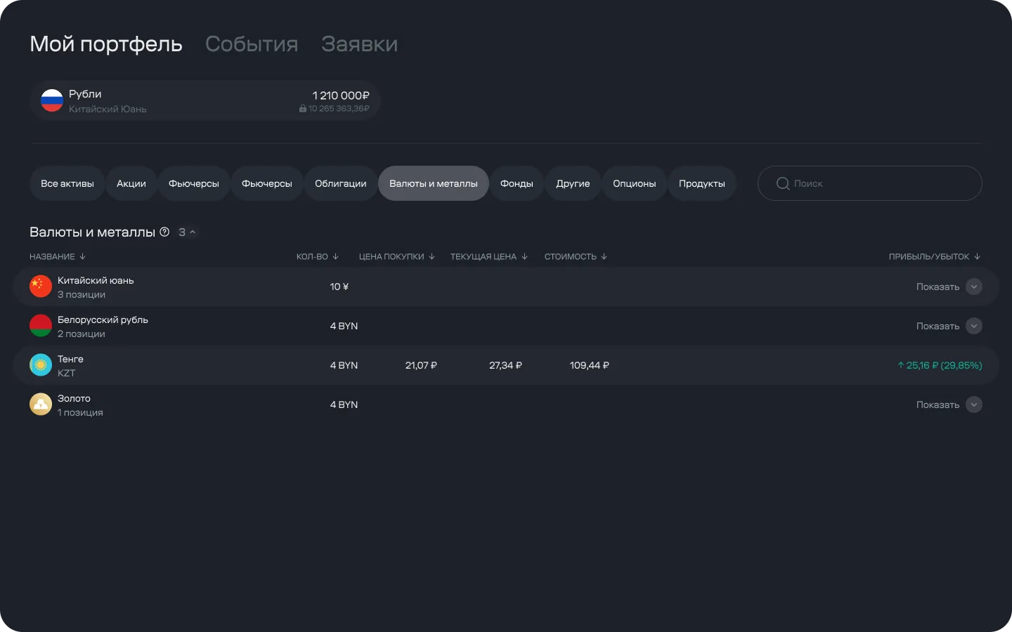
A single currency can sit in several positions, bought at different prices at different times. For tax purposes and for understanding results, those are separate records; for the question “how much yuan do I have”, they’re one. Rows are collapsed to the instrument level, and the position-level breakdown expands on demand. The total is always visible; the detail shows up when it’s needed.
Options: the product’s most expensive rejection
The options board is the densest screen in the dashboard, and there’s no way around that: choosing a contract means seeing strike, theoretical price, volatility, and both sides of the order book at once. Thinning it out just forces the client to compare from memory. The underlying asset’s current price is set into the table as its own row: it splits strikes into “in the money” and “out of the money”, the main reference point when choosing. Every header carries a tooltip — even an experienced client isn’t expected to remember which model this particular system uses to calculate theoretical price.
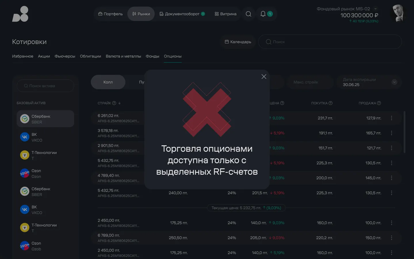
But density wasn’t the expensive part. Not every account can trade options — only designated ones; the rest can only view the board. The rule itself is reasonable; the problem was the timing. In the old dashboard, the client found out about it when submitting an order, after already picking an asset, strike, and expiry. Looking through support tickets, this turned out to be the single most common reason for a call to the trading desk.
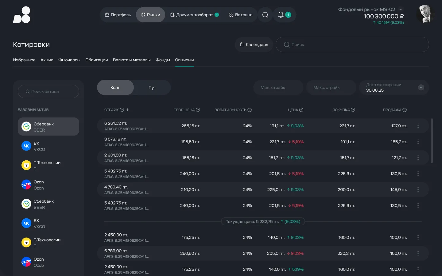
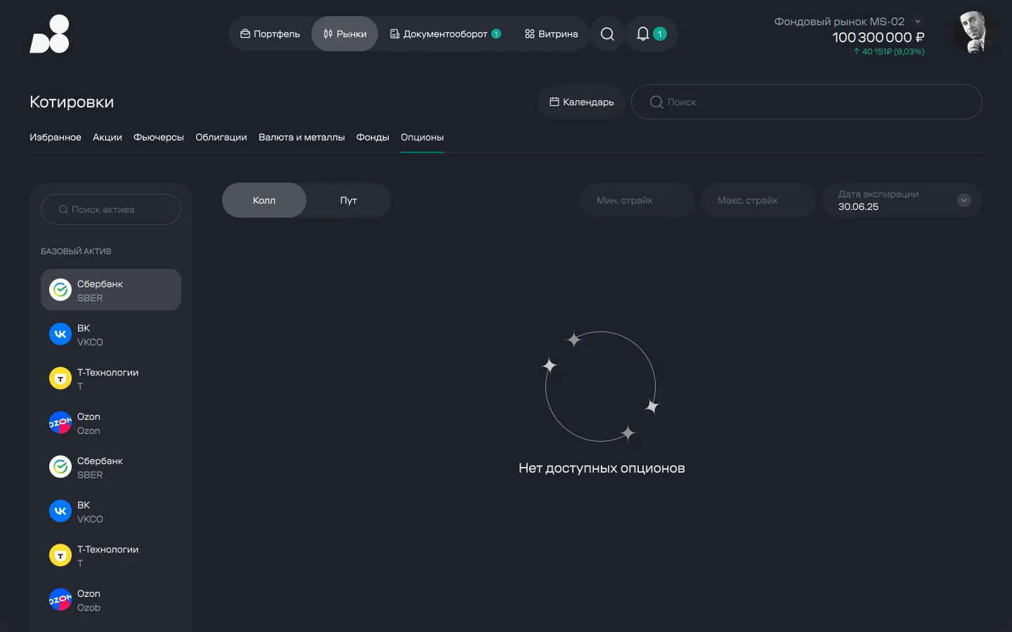
So I deliberately kept the empty state and the restricted state apart. “Nothing matches these filters” and “you can’t trade from here” are different problems with different next steps. Merging them into one grey screen just sends the client to find out why over the phone.
The combination of underlying asset and expiry date returned no contracts. The filters and asset list stay put: the client changes the date right there, without going back or guessing what broke.
The restriction is shown the moment the client opens the screen from this account, not when they submit an order. The data underneath the message stays visible: anyone can view the board, they just can’t trade from here. The next step is obvious — switch the account in the header, which hasn’t gone anywhere.
A regulatory gate at the edge of the catalog
The over-the-counter product catalog was owned by another designer, but the gate reached into my scenario: the order was assembled in the trading surface and then tripped over a catalog requirement. We worked through it together, so what follows is about the seam, not the whole section.
Before trading a complex instrument, a non-qualified investor is legally required to pass a knowledge test. That’s a legal requirement, non-negotiable. An important caveat on scale: most clients in D8’s segment qualify by asset threshold and hold qualified-investor status, so the test doesn’t apply to them at all. The gate is seen by roughly a fifth of the client base, which capped how much this could ever move the needle.
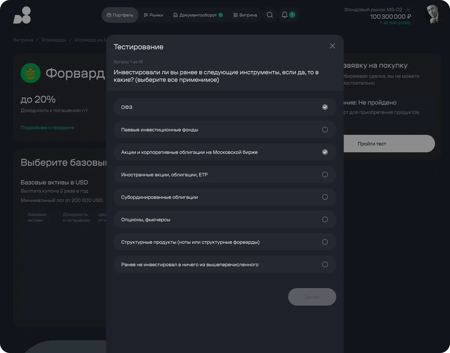
The one thing we could control was when the client finds out. Previously the test surfaced at the end: the client picked a product, set the parameters, hit “buy”, and got a questionnaire. We moved the test status and the button up into the order card, onto the product’s first screen. The gate is now visible before any time is invested — and it’s wasted time, not the legal requirement itself, that turns this into resentment toward the broker.
The test itself runs as a modal over the product page, not a separate section: after the last question, the client lands back exactly where they left off, with the instrument already selected.
Results
First measurement — four months after the full rollout.
The headline number went from 38% to 64%: clients now handle two-thirds of operations themselves. Options rejections dropped the most in percentage terms and confirmed the hypothesis almost literally — people didn’t need the rule explained to them, they needed to see it in time.
The last one is an honest miss. I expected moving the gate to the first screen would noticeably raise the test-completion rate. It didn’t. Two things came together here: only non-qualified clients ever see the test — roughly a fifth of the base — and at that sample size, six percent is indistinguishable from noise. It looks like the questionnaire filters out not people who didn’t make it that far, but people who aren’t willing to sit through it at all, and moving a button doesn’t get past that wall. In hindsight, I wouldn’t have staked a separate hypothesis on this one — the stakes were small from the start, and the segment size made that clear before we ever measured anything.
What’s next
The real result isn’t the screens
The visible outcome is the dashboard. The more valuable one is the table underneath it.
It’s a single component that handles different asset classes with different units, groups positions by instrument, carries empty and restricted states, and a tooltip on any header. Anything new the house adds to the shelf slots into it without new design work — and that’s what outlives this particular redesign.
The second thing that outlasted the project is the four gates. They’re cheaper than any design system, and they settle most arguments before a mockup even exists: the question isn’t “do I like it”, it’s whether it passes or not.