Hotel card for Anex Tour
2025 · Lead Designer

Anex Tour is one of the largest tour operators in Russia. When I joined the company, the hotel page was the main point of decision and the main point of loss. Most travellers passed through it while choosing a tour — and most left. Not because of the tour, not because of the prices. Because of how the page was put together.
The page used to argue with the user — it overloaded them, hid what mattered, duplicated the secondary. It had to become a page that helps you choose.
What it was
The interface had been built up over years on top of the previous one. By 2025 it was a set of blocks with no hierarchy: a main photo with no interactivity, information duplicated two or three times, prices with no context, small fonts, dense tables. On mobile — impossible to scroll. The desktop version looked like an admin panel that a customer had wandered into by accident.
— brief from management, January 2025
The metric we started with
What I had and what I didn't
There was no budget for our own research — the timeline was tight, the page had to be re-released before the high season. I couldn't run 50 in-depth interviews or push a large A/B series into production. So I leaned on open industry data from major OTAs: Booking Travel Insights, Expedia Group reports, Google Travel Trends, TrustYou. If traveller behaviour patterns across these sources confirmed a working hypothesis — we moved forward.
Context and timeline
Hypothesis
The page loses the user in the first seconds because it doesn't answer the main questions of choice: where, how much, what's inside, can I trust it. If you lay these four questions out across the first, second and third screens — the user will stop leaving.
Principles
What I verified
Three blocks of hypotheses — content, price, UX. Each one phrased as "if → then", so a decision could be rolled back or confirmed with numbers.
Content
Price
UX
Confirmation by data
I checked each group of hypotheses against reports from Booking, Expedia, TripAdvisor, Google Travel and TrustYou. Below is what was confirmed and became the basis of the decision.
Solution
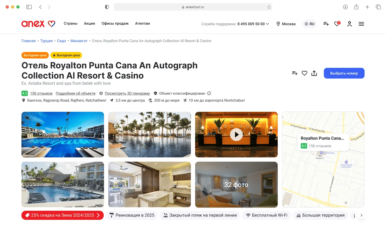
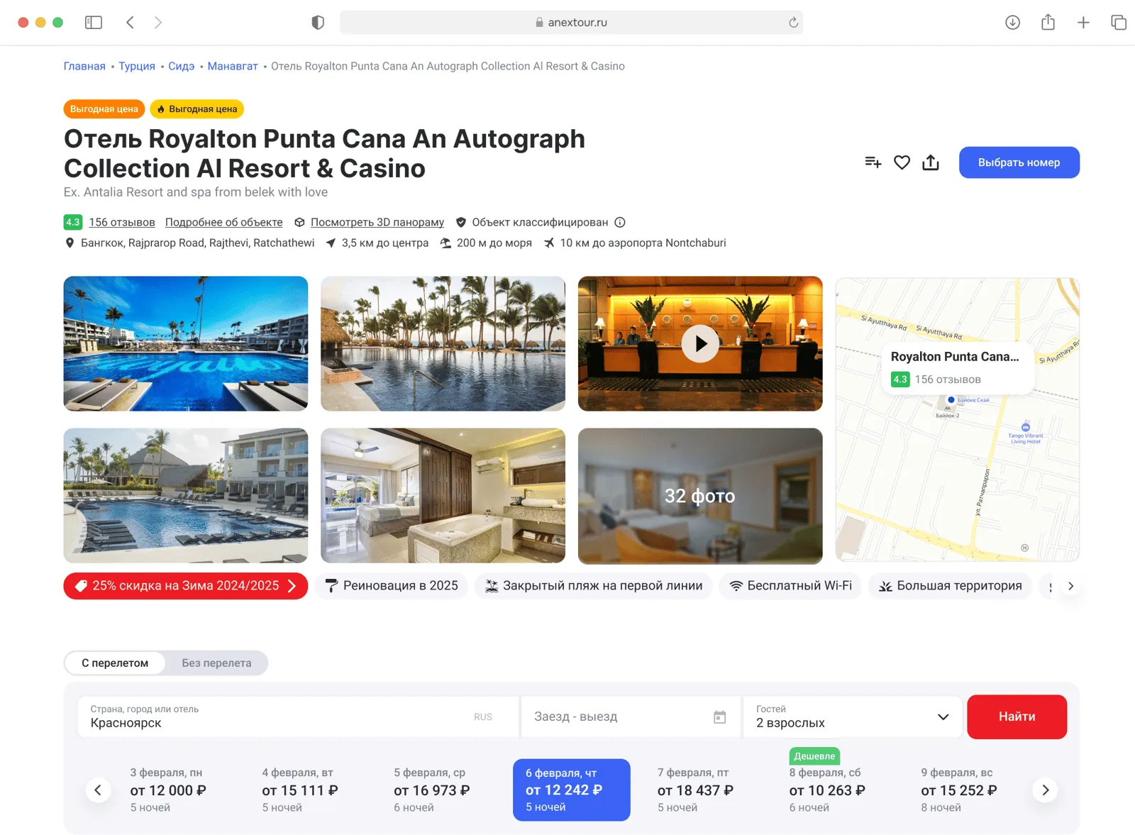
I rebuilt the page from scratch. Five blocks, each answering a specific user question at the right moment. The main screen — in 3 seconds. The price — no surprises. The rooms — with scenarios. The reviews — from those who actually stayed.
The key hotel information, photo gallery, map and price dynamics for nearby dates — all on one screen. The user sees the star rating, score, "from" price, location and the character of the hotel at a glance. Next to the price — a mini-wizard over ±14 days: you can see where the minimum is, where the peak is, and change dates in one click without going back to search. Users used to leave to find "when it's cheaper" on third-party sites — now the comparison sits right inside the card. The photo gallery is interactive and switches by type (rooms, grounds, restaurant, beach). The map shows real distances to the sea, the centre, the airport — in minutes and metres.
The goal is to answer "where, how much, what's inside, can I trust it" within the first 3 seconds and not let the user slip into cross-site comparison.
Each room is a card with a photo, a short description and tags (sea view, balcony, family, all inclusive). The tags work as filters: pick your criteria, see only what fits. No tables, no overload.
It helps you decide by scenario: "family with kids", "couple on honeymoon", "business trip".
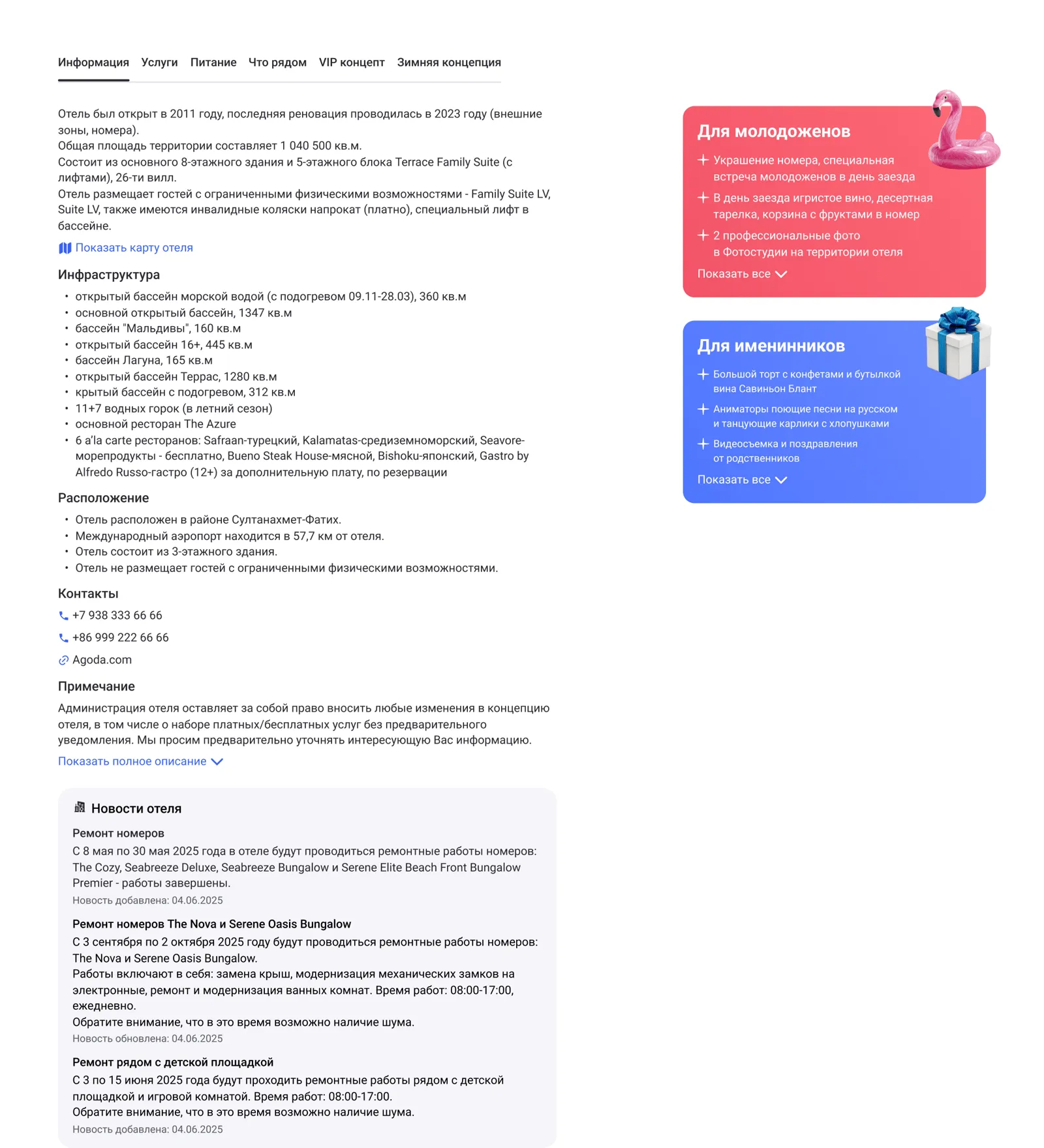
A long text with infrastructure, services, rules. According to OTA data, only 12% of users read this block — but its very presence creates the sense of "complete information". I kept it, but collapsed it by default and broke it into meaningful groups — meals, entertainment, kids, rules.
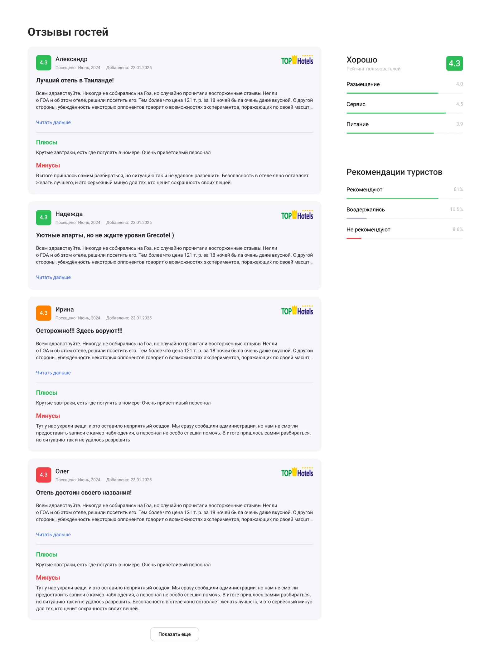
The final decision block. Only verified reviews — from users vetted by the tour operator. The rating is broken down by aspect: cleanliness, food, location, staff, value for money. Sorted by date — recent first, so the user sees the current state.
81% of users read reviews before booking — this block must not be a formality.
What didn't work the first time
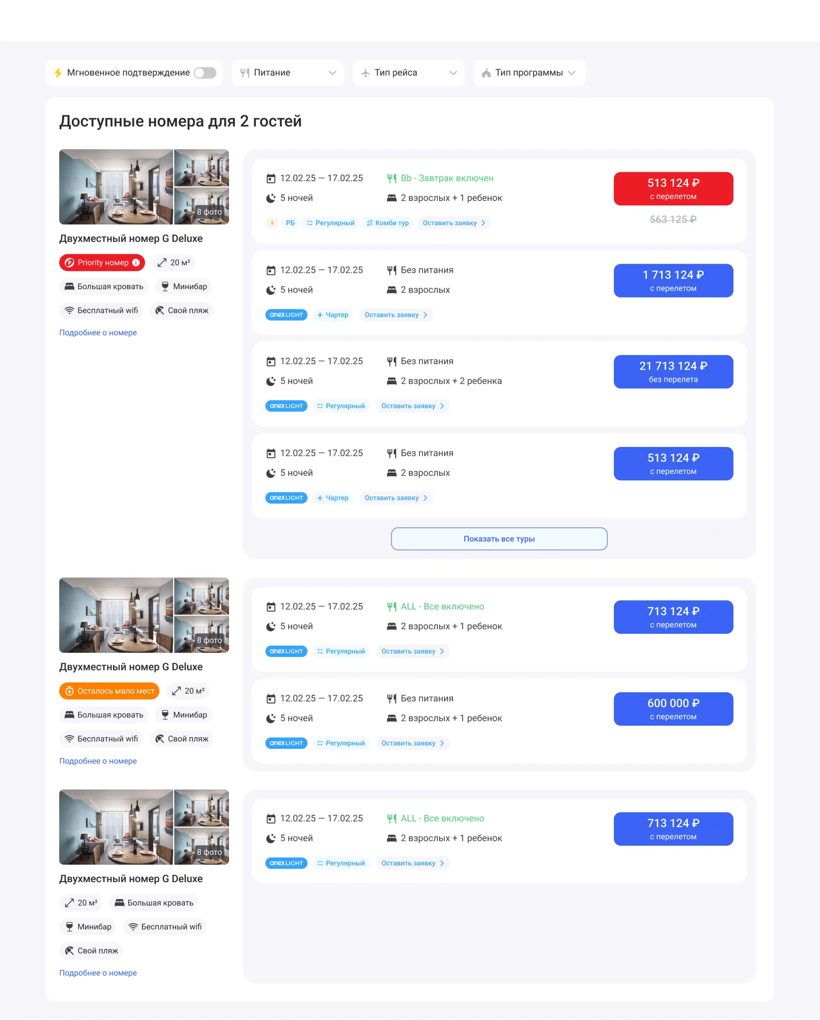
In the first version of the "Room options" block, the tours inside a room ran as a horizontal strip — scroll sideways, pick one. In the demo it looked tidy. The problem showed up at scale: a single room type could pile up 20–30 tour options — meals, length of stay, airline, insurance. The user scrolled the mouse sideways dozens of times, and comparing options against each other was almost impossible — what was off-screen to the right had dropped out of memory by the time you looked at the one on the left.
I had to flip it: the tour options inside a room became a vertical list, row after row, like a booking table on an OTA. Price, length, meals, flight — parallel columns you can scan top to bottom with your eye. Comparison turned from "scroll memory" into ordinary reading.
Why it worked
A hotel page isn't a catalogue. It's where the decision to buy a holiday is made. It used to argue with the user. Now it leads them: first confidence in the choice, then price, then services.
The main thing didn't change in the layout. It changed in the order of information. The page used to try to tell everything. It started to answer questions — one at a time, at the right moment.
Some metrics and final functionality are not disclosed under NDA. The screenshots are fragments of the public version of the redesign.